Your Custom Text Here
“In my own words…”: Indian artist V. Ramesh at Gallery Threshold, New Delhi
Gallery Threshold features solo exhibition of works combined with personal belongings from the life of V. Ramesh.
Indian artist V. Ramesh brings the details of everyday life into his paintings, prompting viewers to have a closer look not just at the art but at the world surrounding them.
Art is more often than not, inseparable from the biography of its maker, and the art of Andhra-born and -based artist, V. Ramesh is no exception. For him though, the story of himself as painter is a more universal story of being human. The figurative form of his painted subjects allude to an outer body, an encasing that holds a deeper, truer form. It is no coincidence then that each of Ramesh’s narrative paintings is punctuated by a material ephemerality, visually discernable in multiple layers.
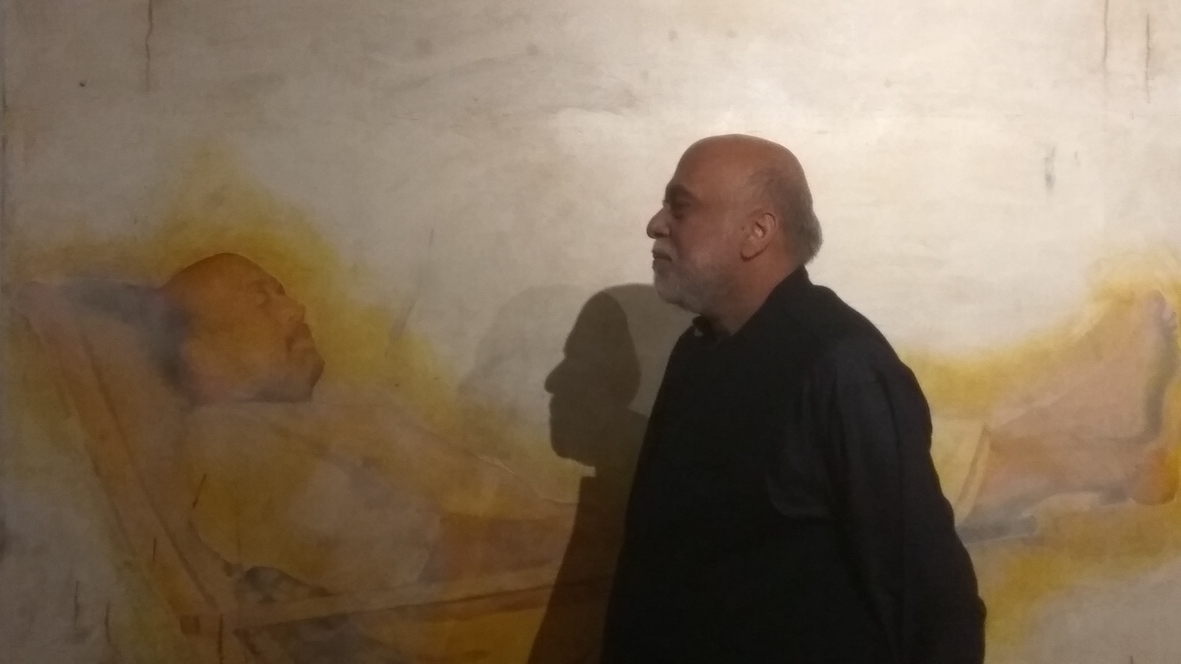
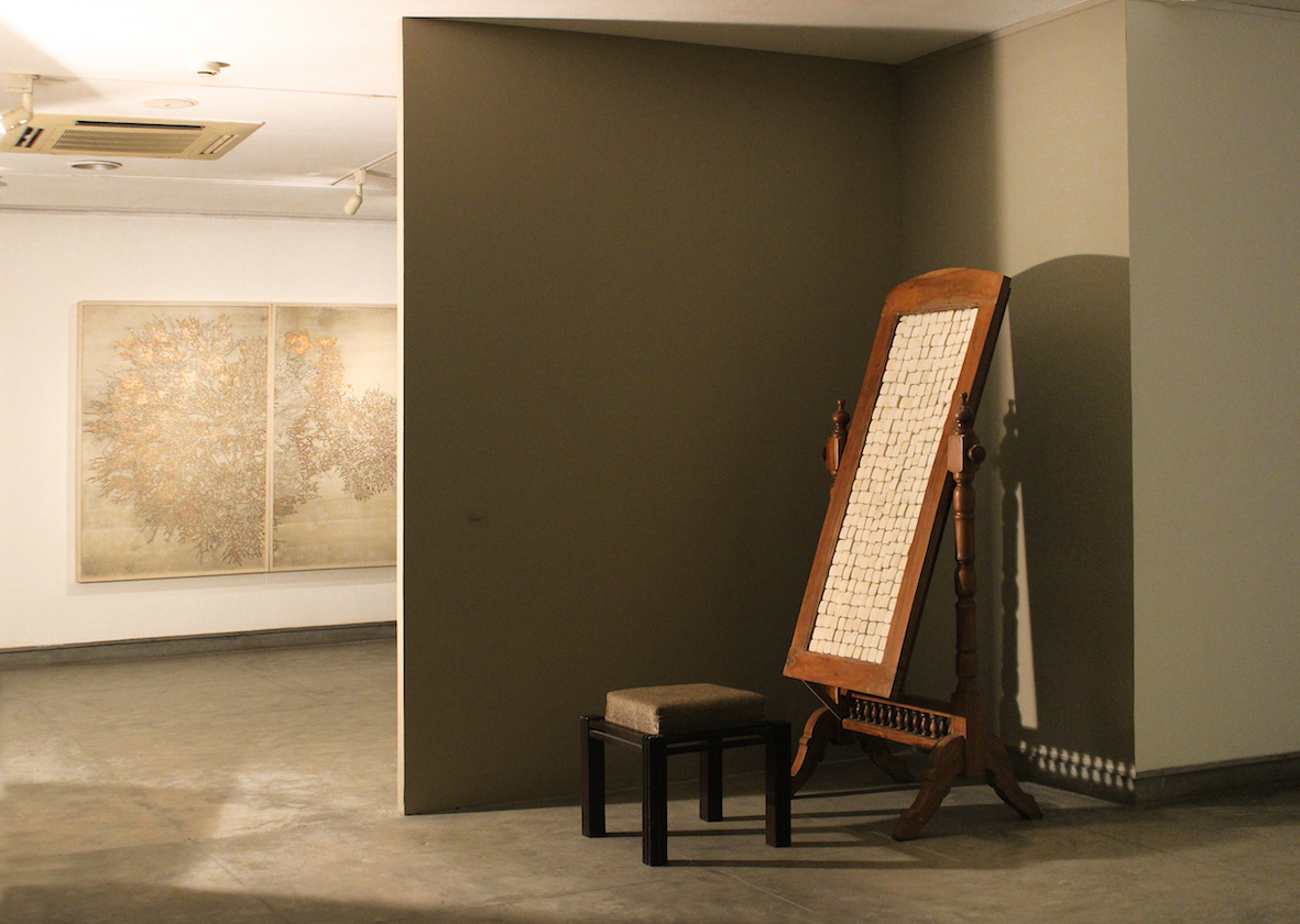
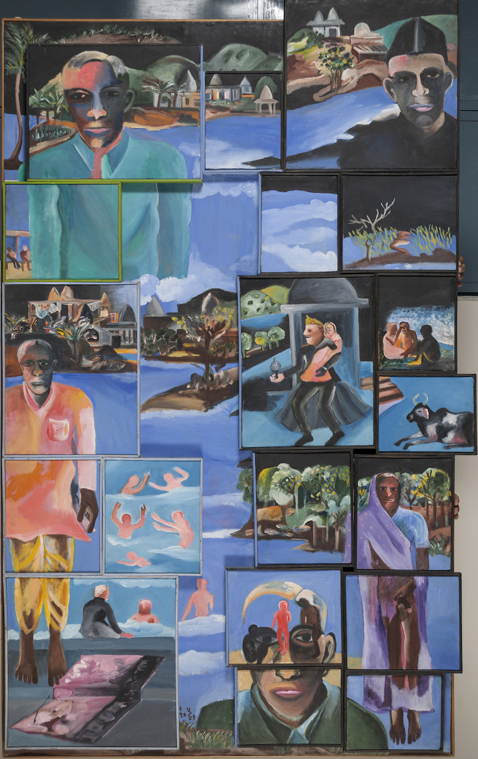
For his recent solo entitled “In my own words…” at Gallery Threshold in New Delhi, the artist presents more than his art. Akin to a theatre stage, the gallery is propped with the artist’s personal belongings. A reclining chair that also features in the painting on the wall behind it, a small studio table propped with books, a mirrored dresser, an umbrella and a calendar with a photograph of the greatly revered Indian sage, Sri Ramana Maharishi are also on display. Each object leads us to better understand the man behind the art.
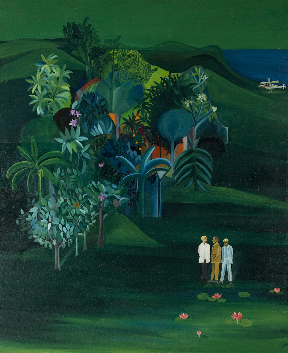
The exhibition features three distinct stylistic series and a large unfinished self-portrait of the artist reclining on his favourite chair. Begun over a decade ago, the 10-by-12-feet canvas became a backdrop in the studio for other paintings being worked on, gathering drips and smudges of paint as well as layers of dust. The image of a contemplative painter seated back in his chair, looking at the smeared surface of his canvas, makes for a rather ironic but somewhat perfect self-image. Alongside this are three narrative canvases, whose figuration is drawn from different scenes of the Indian epic The Ramayana. Describing feelings of wonder and fascination to having heard these stories narrated to him by his grandmother as a child, Ramesh paints them anew as an emotional landscape that riddles the observer into seeing a depth of visions.
The three allegorical paintings entitled Saavadhan, Genesis of an Epic and The Moment of Epiphany, all executed in 2016, are largely inspired by the medieval literature of mystical saints and bhakti poets. As Ramesh speaks with Art Radar, he shares his deep respect and lure to the lives of great women scholars like the Kannada poet Akka Mahadevi, and Lalleshwari of the esoteric Kashmir Shaivite tradition. As these poets’ words urge the devotee to look beyond the body and seek one’s true nature, so do the artist’s paintings by urging the viewer to look beyond its surface and recognise the essence of the story’s plot. Each painting is accompanied by a text and graphic illustration, giving the viewer context to read into the painted forms.

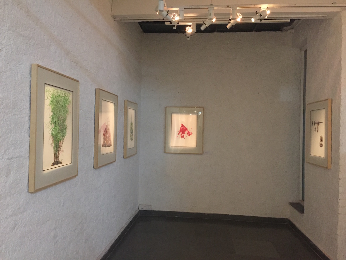
In the corridor that connects the two larger spaces of the gallery are hung a series of seven watercolours that each portrays a peacefully seated dog. Inspired by his many visits to the ashram of Sri Ramana Maharishi, the artist describes the dog as the ideal devotee. Against a faintly painted, distant landscape, like a tracing of the fragile world we occupy, the dogs lie faithfully in the foreground.
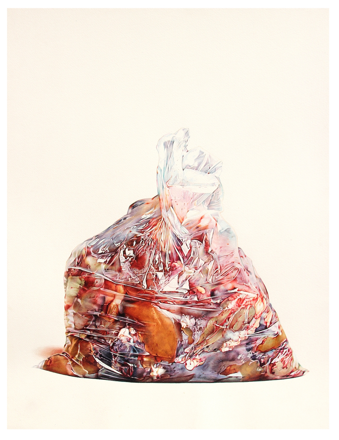
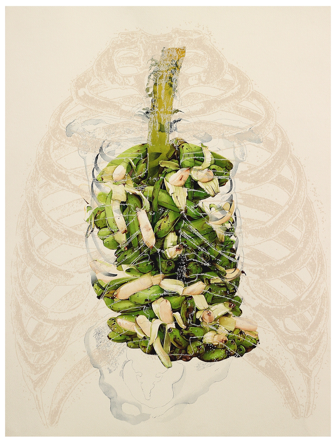
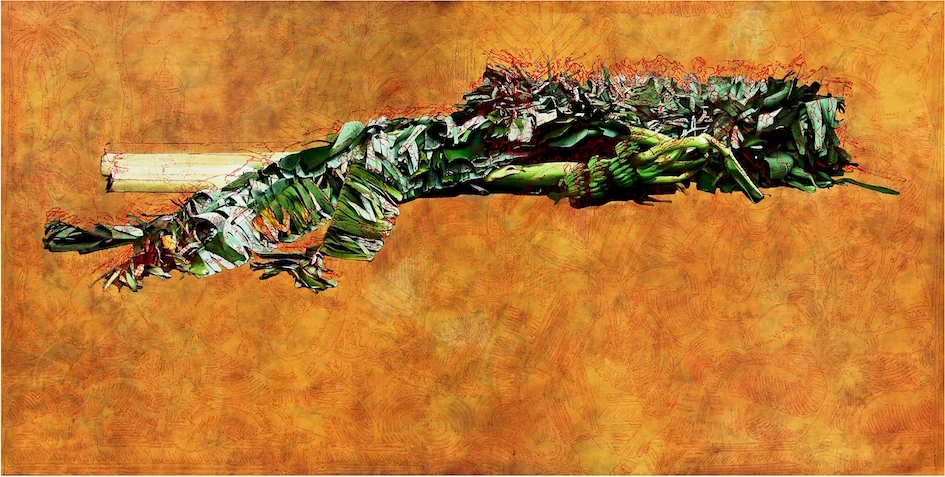
Ramesh’s desire to express gratitude to the knowledge he gained at the Ashram resulted in the ongoing series of 108 drawings – or offerings, as they are also titled. A bag of meat that he saw a man once carrying in a plastic bag for instance, is painted in hyper-realistic detail alongside the painting of a ripened pomegranate that has literally burst out of its skin. In another Offering, this time of a banana, the painter skillfully paints what appears to be a shadow of a human skeletal torso, the fruit playing the visual metaphor of embodiment of an innate self that when ripe sheds its bodily manifestation.
The exhibition reveals the artist’s mastery in painting his subjects, for each is a manifestation of his own memories and observations. Standing closer and then moving farther back to view each painting, the viewer’s eye is constantly challenged to look deeper. Steeped in ideas of devotion and faith, the V. Ramesh’s ability to so lucidly translate his thoughts onto canvas is admirable and does leave the viewer questioning the surface of the things he sees, and of the world he sees.
“Ether is all that is”: G R Iranna at Gallery Espace, New Delhi – in pictures
G R Iranna ponders the meaning of life in his recent solo exhibition at Gallery Espace in New Delhi.
“This great Being is endless and without any limit. It is a mass of consciousness only”. Taken from the ancient Indian scripture Chandogya Upanishad (VIII. 3. 4), the verse encapsulates the nature of existence and introduces G R Iranna’s solo exhibition “Ether is all that is”, on view at Gallery Espace, New Delhi until 8 March 2017.
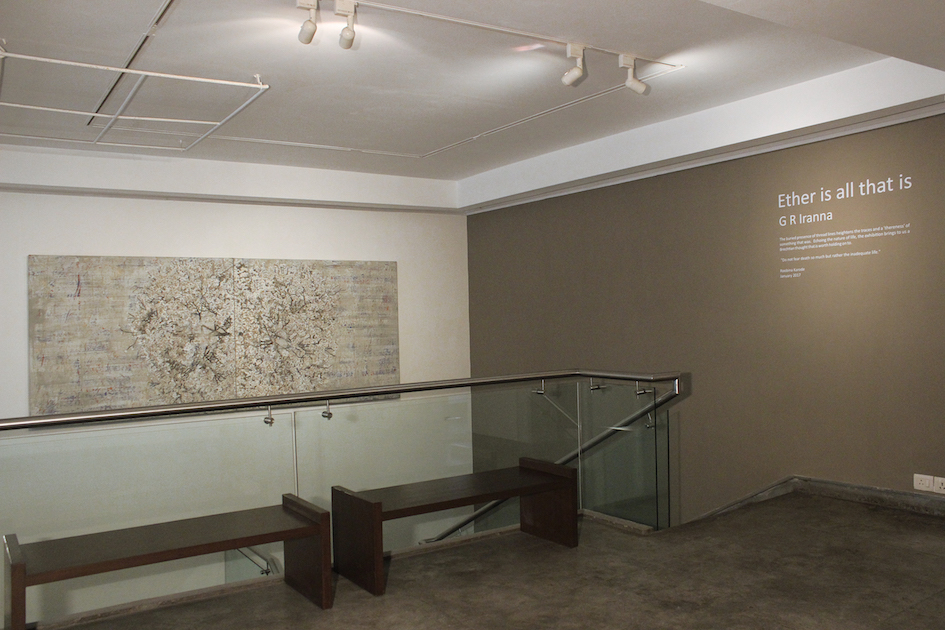
Unfolding at three levels – through material, form and time, the exhibition “Ether is all that is” at Gallery Espace in New Delhi traces G R Iranna’s exploration into the realms of the unknown, beyond the abstract form and its motivating thought, into a formless, eternal state. Being careful not to limit the visual and conceptual experience of his show, he carefully chose a title that resonated the deep resolve of his practice.
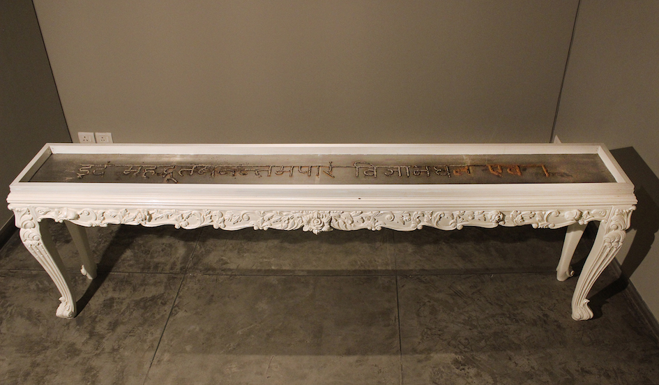
The smell of sandalwood wafts through the gallery space and is the first encounter of experience. In a small, dimly lit room of the gallery is the long console, its top embedded with a meshing over which is laid out the burning words “Idaṃ mahadbhūtamanantamapāraṃ vijñānaghana eva.” Sandalwood powder or chandana is known for its medicinal properties and to spiritual seekers is considered a metaphorical link between the earth and the sky, between the finite and the eternal. The continuous burning of the sandalwood powdered words leaves a trace of ash, and in doing so defines the moment material form becomes immaterial. The words and all that they reveal return to ‘ash’ – the medium that the artist chooses to draw with, coat onto or burn off.
While speaking with Art Radar, G R Iranna elucidates the material context of his show by saying, “We treasure diamonds, but to nature they are but rocks.” With the understanding that everything is to return to dust, Iranna began to think of how to visually communicate the transient. He began using charcoal a few years ago and evolved to employing holy ash as a way to punctuate human mortality more vividly. Known in the Hindu tradition as vibhuti when smeared on one’s forehead, it signifies the eternal consciousness within us while also serving as a constant reminder of our eventual consummation.
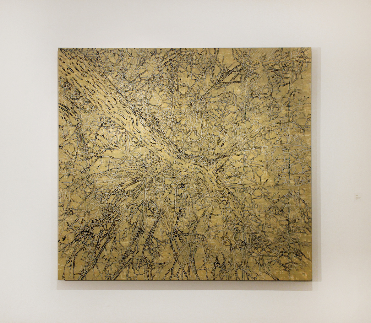
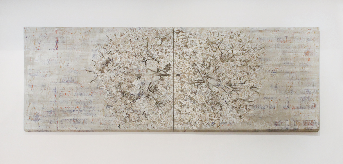
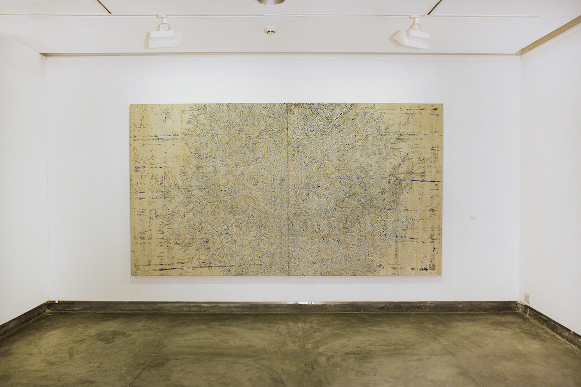
While in Mexico, Iranna came upon a tree that was 3,500 years old and standing beside its massive trunk, looking upward towards the network of branches it supported, the artist marvelled at this silent witness of times gone by. Filled with a sense of wonder and humility, he explains the tree’s repetition in his work as a metaphorical reminder to us existing as observers, playing out our part within the larger, cosmic scheme of things. Of the many relationships we sow through our lives, some get charred, few smolder and still others continually take root. Iranna plays off these as he paints the branches of his trees with ash in a series of works entitled Ethereal Tree, Beautiful Burning Tree, Lofty Tree, Heaven on Water, all executed in 2016.

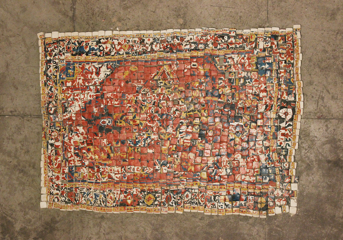
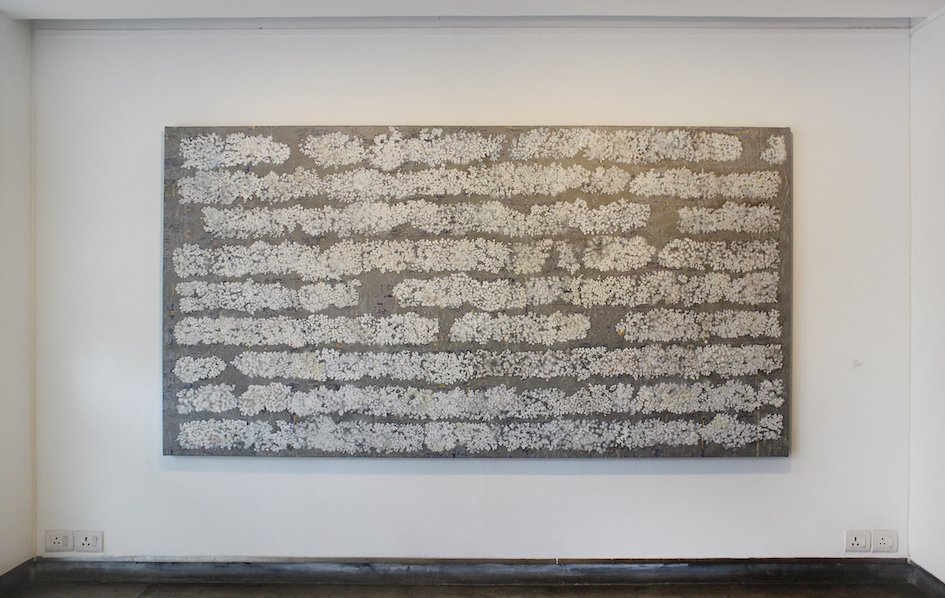
Also part of his repertoire of forms is that of the carpet – laid out as a decorative floor covering or a mat for prayer. The carpet wears away like the memories of those whose feet have walked over it, until the day it too is threadbare and returns to dust. Made of brightly painted ash bricks, a rich patterned floor work Ethereal Beauty (2016) puts the point across quite lucidly.
In a corner of the gallery is placed a full length standing mirror, except the mirror’s surface itself is replaced with cubes of ash. Iranna’s belief is that self-reflection explains the relationship between the ego and the body and in this work entitled Loved Ash (2016), the self image is in fact, ash itself.
Iranna has been working on this body of work for the last two years. The first work to be publicly presented was Garbh, an egg shaped larger than life form, supported by Gallery Espace’s Founding Director, Renu Modi for the Kochi-Muziris Biennale 2016. Iranna shares his intent to sculpt a form that was solid and strong but also fragile. Built in a small room, with a narrow opening, Garbh consumes the space it occupies and by the end of each day sheds a circle of ash around itself.
The work will need to be destroyed at the end of the Biennale in March and with it, the work will be complete – its birth from and end into the formless, while leaving a daily trace of residue as a memory of its existence. Coming full circle to the first piece of his gallery solo, Iranna successfully imparts a multi-sensorial experience through a predominantly visual language that takes the viewer through life’s journeying in a rather simple, yet purposeful way.
“Of Absence and Weight”: Pakistani-born artist Seher Shah at Nature Morte, New Delhi
Nature Morte holds second solo exhibition at the gallery by Pakistani-born, Delhi-based artist Seher Shah until 11 February 2017.
Seher Shah works with drawing, printmaking and sculpture, exploring a range of processes that draw on her background in art and architecture.
Architectural construction can be understood through a series of abstractions, building codes and measurements. These take shape first as spatial diagrams and are then employed to make the abstract thought concrete. Because they function between space and language, architectural theorists like Robert Somol claim their function to be performative rather than representational.
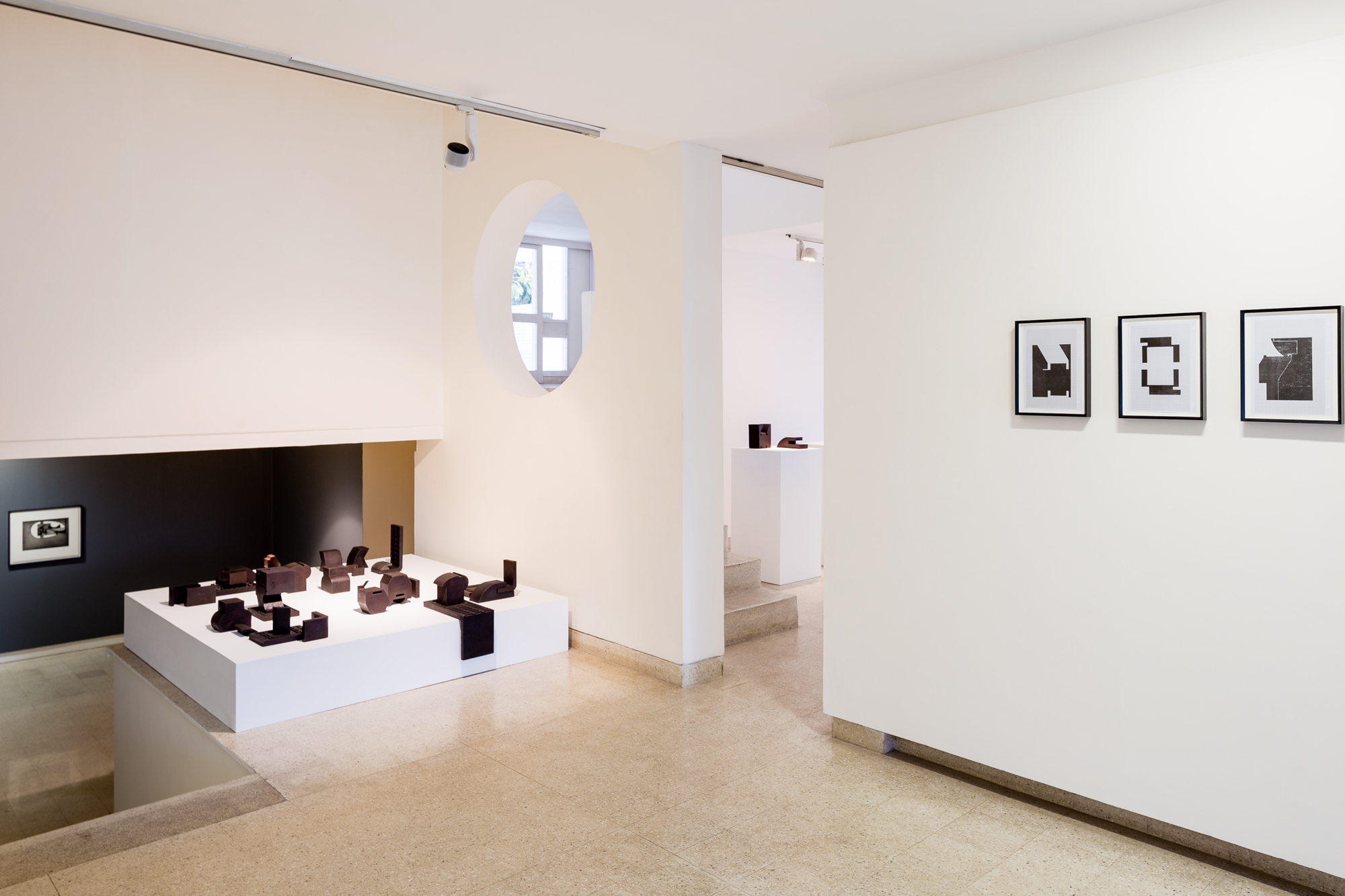
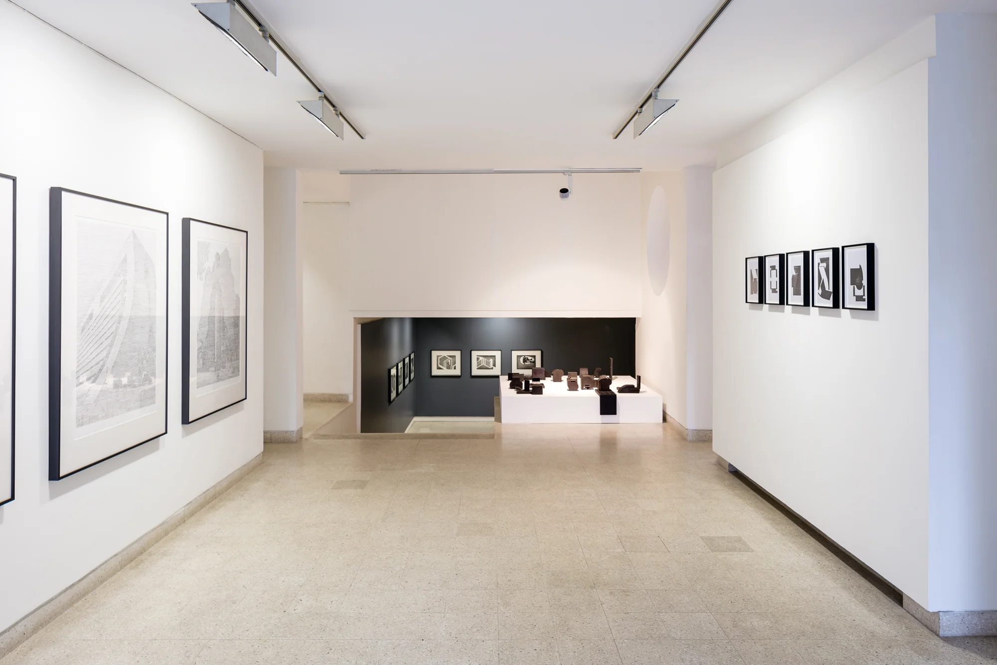
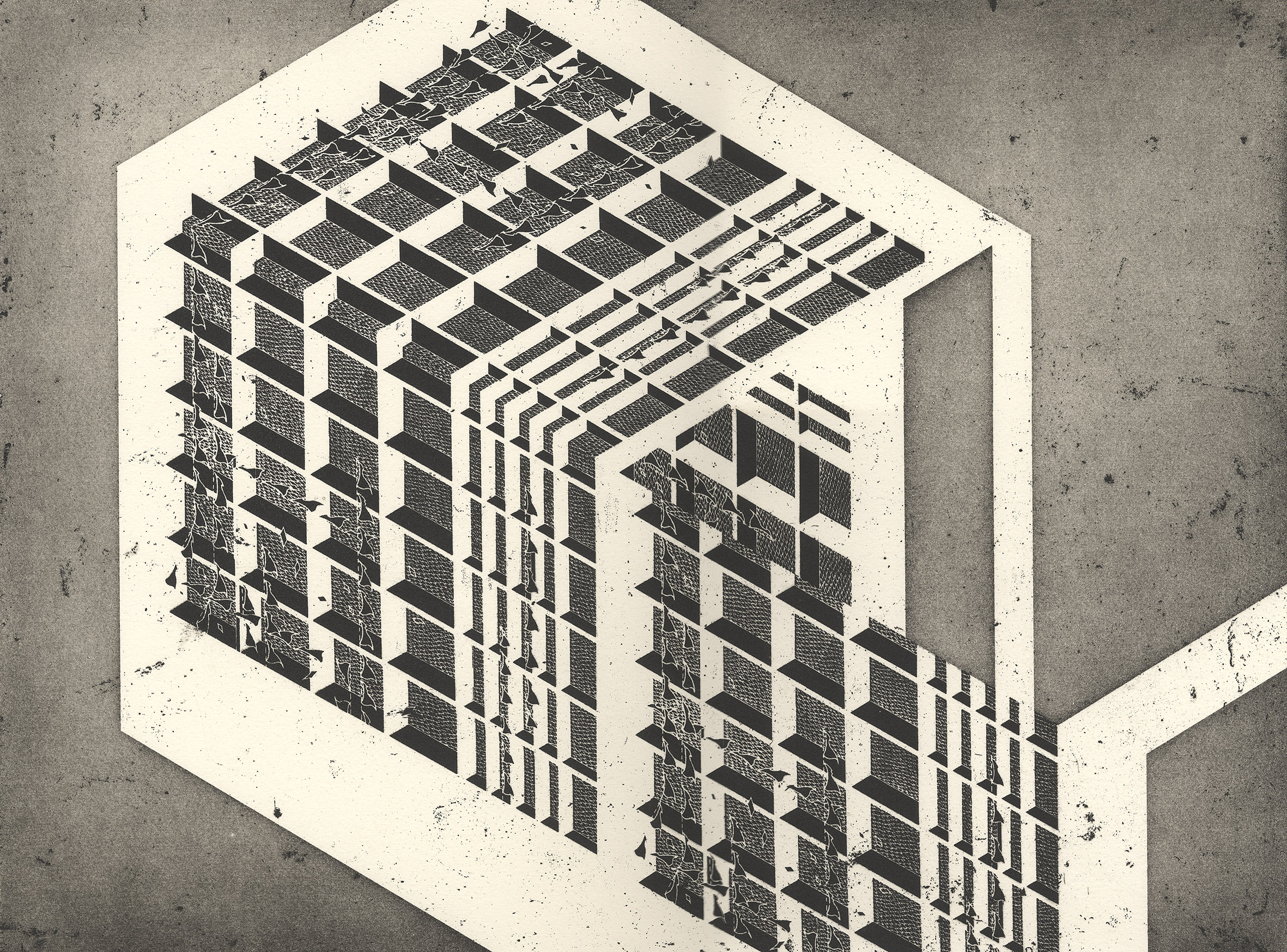
Seher Shah’s art draws from a similar pool of ideas. Her practice began in architecture and developed into a series of experiments that explored abstraction beyond an intended architectural function. Lines and forms began to perform within their designated space, often appearing in repetition, encountering weight and scale as well as multiple perspectives each time. These in turn, acted in response to the repetitive patterns discernable in urban planning yet constructed towards an unreal, ambiguous end. Impressively echoed in the six-part pen drawing entitled Flatlands (corner) (2016), entered through a corner elevation with multiple modular forms, an imaginary skeletal architecture introduces Shah’s ongoing solo exhibition, “Of Absence and Weight”.
Exhibiting in New Delhi after a gap of six years at Nature Morte, Shah’s current solo show hinges on the interplay between the abstract and the real in a way that urges one to think of impermanence and materiality. While speaking withArt Radar, Shah explains that her work evolves in series, each an exploration that takes a few years to resolve into a larger body of work.
In Brutalist Traces (2016) Shah reimagines aggressive modernist architecture. Built largely for institutions and corporates and typically made of concrete, considered brute or raw, modular elements are stacked and structured for functional purpose. Shah erects these buildings in frail horizontal lines of graphite that cut their enormity and austerity down to ghostly markers that eerily punctuate our landscape.
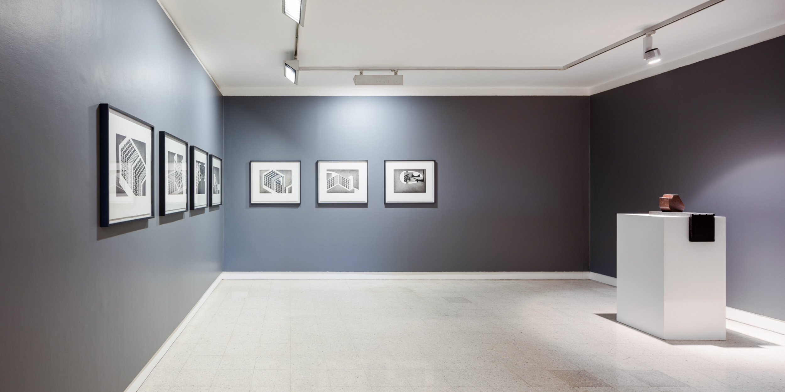
On the cusp of disappearance, these drawings lead into the sense of erasure more starkly witnessed in Mammoth: Aerial Landscape Proposals (2012), made in collaboration with photographer Randhir Singh. Taken while flying over the United States, Shah deftly inserts markers – sometimes as columns or forms of black, sometimes a line, that obliterates a part of the landscape, yet at the same time creates potential monuments. In doing so, Shah suggests the making of a new ‘history’ and focuses our attention on the temporal biography of the land we inhabit. While describing the work, she says: “I see them [inserted markers] as place-holders that aggressively ‘hold’ space but are not architectural.”

A similar eeriness is accented in the second photographic series done in collaboration with Randhir Singh, Machrie Moor(2014). Here, the megalithic stones are photographed against their barren landscape – man-made historical testimonials that mark their visceral presence and inspire Shah’s cast iron sculptures Untitled (2015). The weighty sense of mass and the bearings of time presented in these two series are rather prosaically composed in Hewn (2014), a body of woodcuts on A4 graph paper. In an extension of the sculptural forms, Shah now explores the negative space of these weighty objects on a flat surface, textured by the wood pressed on paper.

While in residency at the Glasgow Print Studio in 2014, Shah produced a series of etchings entitled Unit Objects (2014). She describes the physicality of the process where the degree of weight applied to the copper plate was as much ink as was pressed on the paper. She became particularly aware of how material deposits appeared in the forms she etched. Visually, Unit Objects revisit building elements – courtyards, elevations, façades, gardens and the like. Boundaries between interior and exterior space are left fluid, dissolved between architectural folds.

Seher Shah, like many of us, is inspired by lived experiences and memories, each stimulating an exploration of a new perspective or a revision of an earlier one. While her time in Glasgow and her travels through Scotland in 2014 influenced the visual forms and structural compositions in Unit Objects, Machrie Moor and the cast iron sculptures, a residency at BorderWork(s) in North Carolina in 2012 introduced her to structural music and the markings in musical score – traces of which are seen in Flatlands.
Rooted in architectural abstraction and the making-unmaking of landscapes, “Of Absence and Weight” also reveals historical bearings: Of the Prehistoric, Of the Industrial, Of the Modernist and Of the Imagined.
Truth is Beauty: Indian modernist Bhupen Khakhar at Tate Modern, London
With the support of the Kiran Nadar Museum of Art (KNMA), Tate Modern holds landmark exhibition of key figure in 20th century painting.
According to Indian modernist Bhupen Khakhar, “Truth is Beauty and Beauty is God”. The Tate Modern provides an opportunity to discover the artist’s extraordinary work and inspirational story, bringing together Khakhar’s work from across five decades and collections around the world for the first time since his death.
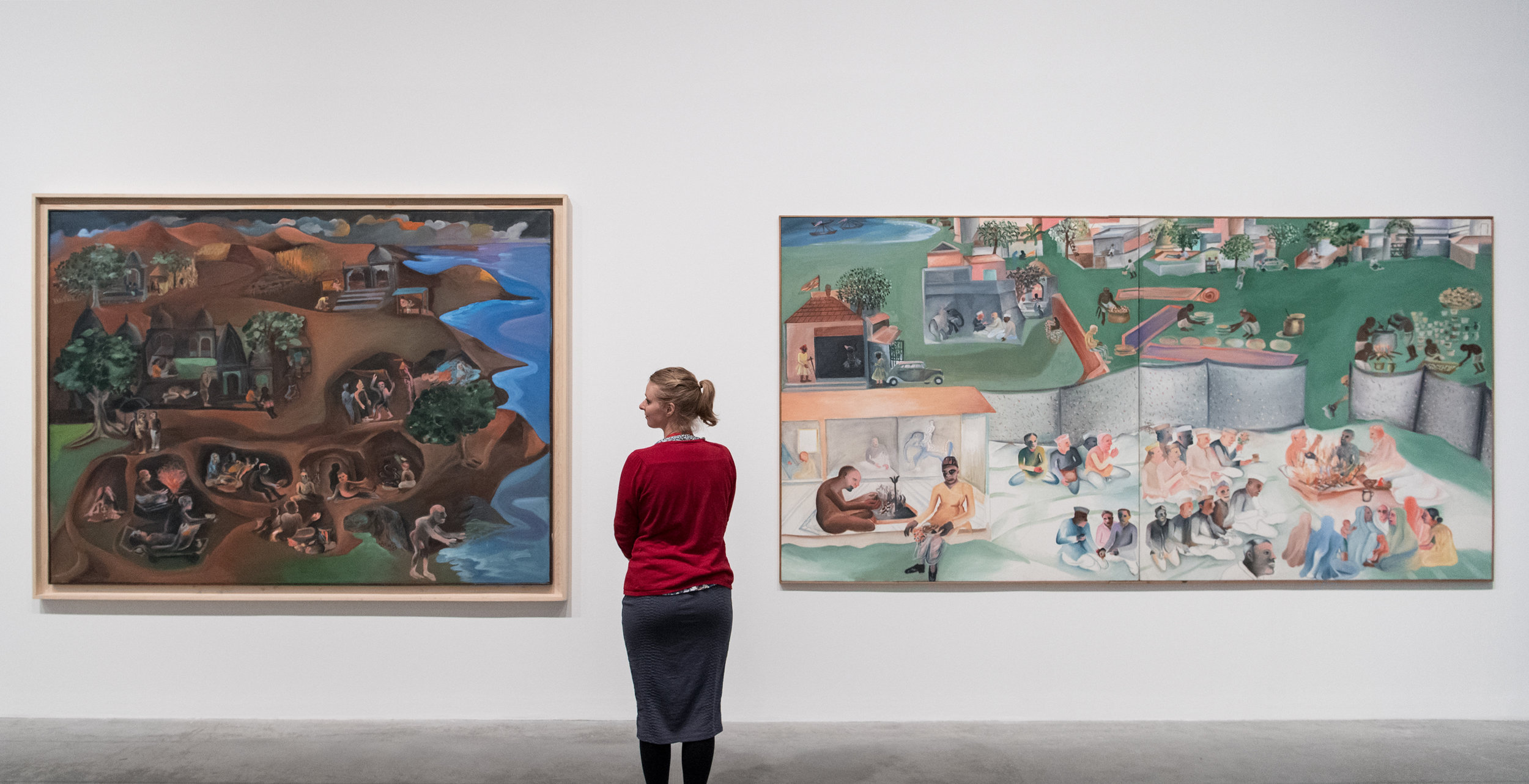
Bhupen Khakhar, “You Can’t Please All”, Tate Modern, 2016, installation view. Left to right: ‘Jatra’, 1997–9, oil paint on canvas, 177.5 x 239 cm; ‘Yagnya or Marriage’, 2000, diptych: oil paint on canvas, 173.5 x 346.6 cm. Image courtesy Tate Modern.
Truth is Beauty and Beauty is God, a self-authored catalogue accompanying the London exhibition, not only explains many of Bhupen Khakhar‘s works, but also their essence and his overall worldly vision. Largely drawn to Gandhian philosophy, he sought the truth through honest representations of the world and through the mundane humdrum of ordinary life. It is, of course, in retrospect that we fully understand the place of this man and his art.
The past month has seen many a review, including the infamously critical piece on The Guardian rousing reactions from many in the art community who have since made it a point to ‘correct’ opinion on Khakhar’s work. For an artist who lived most of his life as an accountant, who was homosexual in a conservative family (and society) and who chose to use the surface of the canvas as a confessional space, the drama that unfolds alongside the exhibition is somewhat similar to the social theatre that Khakhar had grown accustomed to and parodied. At his first international showing since 2003, Art Radar refocuses on the makers of the exhibition, the institution that hosts it, the critics and commentators, and the artist who has kept them all at work.
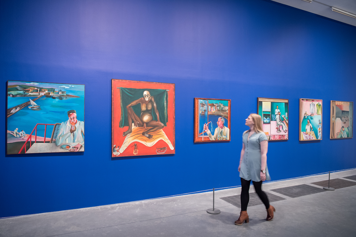
The Bhupen Khakhar retrospective “You Can’t Please All” opened on 1 June 2016 at the Tate Modern, supported by the Kiran Nadar Museum of Art, and runs until 6 November 2016 as part of an ongoing partnership between the London museum and Berlin’s Deutsche Bank Kunsthalle, where it will travel to next. Launched in 2014, the collaboration aims to bring art from Africa, Asia and the Middle East to new audiences internationally. Fittingly named after a work believed to be a self-portrait, You Can’t Please All, acquired by the Tate Modern in 1996, the exhibition is an ironic reminder of the murky goodness that was Khakhar and of what informed his self-taught practice.
Bhupen Khakhar (1934-2003) is described as one of India’s pioneering Modernist painters who brazenly championed the bazaar aesthetic, combining Indian traditional art with Western pop art. His oeuvre can be traced to 1962, when he moved from Bombay to Baroda and joined the Faculty of Fine Arts at Maharaja Sayajirao University for a Masters degree in Art Criticism. Mentor and friend Ghulam Mohammed Sheikh introduced him to a network of artists, intellectuals and poets, each of whom would contribute to their co-founded journal Vrishchik (or Scorpion, 1969) and become regulars at the numerous parties Khakhar hosted.
Khakhar was to become a bohemian personality who surrounded himself with people, each of whom he learnt from and who in turn, sheltered his deep complexes. You Can’t Please All (1981) is considered iconic because it signalled Khakhar’s self-awareness as a gay man and suggests the personal difficulties he faced at the time. The painting depicts a nude lifesize figure on a balcony watching characters from an ancient Aesop fable.
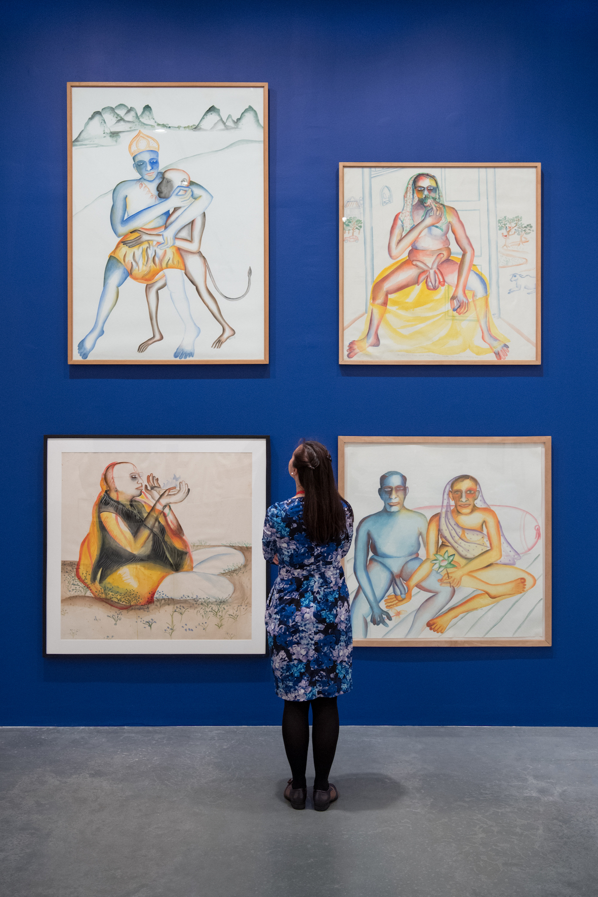
The retrospective unfolds chronologically and includes oil paintings, watercolours, experimental ceramics, accordion styled books and a biographical diary. Comprising works executed over five decades, one can trace the many artists and artistic styles that inspired Khakhar’s own work. In the 1960s, it was the Company School and the art of Raja Ravi Varma. In the 1970s, he drew from devotional and calendar art, inspired in particular by Kalighat and Nathdwara paintings as well as the awkwardly flat 14th century Sienese frescoes. This was also the time he began making his “trade paintings” – a series of 1-square-metre sized portraits of people defined by their occupations. Amongst them are De-Lux Tailors (1972) and Barber’s Shop (1973) – narratives of ordinary lives, of the city’s petty bourgeois that represented India’s urban reality.
Following the work of American modernist painters like Jasper Johns and Robert Rauschenberg, Khakhar experimented with collage in paintings like the Pan Shop (1965) and Night (1996). His lack of formal training allowed him to freely borrow from Western artists like Henri Rousseau, Howard Hodgkin and David Hockney. It was the way Hockney and others in Britain represented homosexual subjects that drew Khakhar to explore a more ‘truthful’ art, eventually evolving into an autobiographical practice.
The boundaries that divided private and public, conservative and modern, bourgeois and elite played out on the same plane in Khakhar’s paintings. Diagnosed with prostate cancer in 1998, Khakhar re-focused his work on ‘disease’ – an invasion of the human body and the humiliation of bodily failure. Khakhar returned to the luminous Kalighat-inspired technique as their translucent glazes of colour enabled him to portray human fragility: the grotesque with the attractive, the worldly with the personal.
The exhibition is a timely reminder of the importance of non-Western artists in a global context, reiterated by the number of reviews and commentaries that the show has generated. Khakhar’s art allows visitors to enter his work through different vantage points, and to recognise Western artistic influences while expanding awareness to a parallel art history on the Indian sub-continent.
From Contextual Sculpture to the Conceptual: Indian artist Krishna Reddy – interview
Krishna Reddy’s solo show at Kolkata’s Experimenter travels across the Master’s research in sculpture and printmaking highlighting the shared vivid interest in material, time and body.

Krishna Reddy_Milan-Marino Marini studio in the fifties_terracotta_22in x 17in_Ed 1 of 5+AP_2016
The exhibition Editionmaker: Contextual Sculpture to the Conceptual on the work of Krishna Reddy opened on May 20th at the Gallery Experimenter in Kolkata and remains on view until July 16th. A retrospective of sorts that punctuates the artist’s practice of printmaking through the skillful application of a sculptor’s hand takes us on a biographical journey of an artist whose multi-faceted and prolific practice elicits a sense of wonder while also reflecting a sense of humility. The exhibition features studio photographs of Reddy’s early sculptures executed in the 1950s & 60s alongside a number of tightly composed watercolour drawings from the 1960s that dwell on various aspects of nature. A series of viscosity prints based on his daughter Aparna’s (fondly called Apu) imaginative mind and the emotional trauma of her adoption from the 1970s is followed by the clown series of 1980s inspired by a visit to the circus, but one that led Reddy to look at the clownish behavior of the world- the melancholic and the sad with a touch of irony. The exhibition also includes the print Demonstrators, executed in response to the student protests in Paris in 1968 as well as a few others from the Sun Worshiper series of the early 2000s.
Priyanka & Prateek Raja of Experimenter Gallery share with Art Radar how the exhibition was conceived and why they thought it was important to show Reddy’s work.
“We personally have been interested in Krishna’s work for years and have been avid admirers and have always looked at his practice with awe and inspiration. Clearly, we were interested because we felt a connect with his work, which was miles ahead of its time and even today, the philosophical and conceptual frameworks of his work is extremely contextual and relevant to us as they have been through time. We also felt that his astounding practice had been appreciated but needed to be seen by a wider and more engaged audience and needed to be understood to the fullest extent of its impact on generations of artists and hence decided to show him solo at the gallery. When we knew that we wanted to show his work at Experimenter, we spoke with friends in the art world who know of his work and Sumesh Sharma at Clark House Initiative had curated an exhibition of his a couple of years ago with Anand Nikam of JJ school and Zasha Colah, also of Clark House Initiative. He was instrumental in putting the crucial aspects of the exhibition together and so was Judith Reddy, Krishna’s wife who’s advice was crucial in enabling the exhibition to take place.”
With over seven decades of work, Art Radar asks the Master Printmaker what makes his art journey memorable and what else is left to come.


On Times and influences:
1. Teaching, learning and growing your own art practice have gone hand in hand throughout your career. From teaching at the College of Fine Art, Chennai (1947-49) to your co-directorship at Atelier 17, Paris (1964-1976) and to your current directorship at The Department of Graphics & Printmaking, NYU, what were your reasons to teach alongside your practice. My purpose in teaching was to open up the students and artists towards a deeper understanding. When we try to promote ourselves, we wind up making sensational art. With political awareness our art will become more meaningful and more human. Aside from my desire to teach, I accepted the position of Director of Printmaking at NYU also out of monetary necessity - living in New York is an expensive experience!
2. The medium of print has often been ignored and relegated as craft, more so in India than internationally. What is your advice to young printmakers today? And does your decision to teach in some way, reflect the need to promote and grow the scope of the print medium. Printmaking has always been relegated as a secondary art form, not only in India but also in Europe and the U.S. I paid much attention to that. Handling materials is one of the great pleasures of printmaking. I wanted to find out all about the materials that went into printmaking – the felts, the paper, inks, zinc and copper plates, acids and so on. One has to dig into materials in order to discover the image.
3. The 1940s were a decade of much change and turmoil that saw the Bengal Famine and the Independence movement in India, as well as the end of the World War. The period that followed was one marked by a heightened sense of humanism and a need to correct the faults of the past. Can you share some of the experiences that shaped your thinking from those early years. I was very interested in making art since a very young age. I had the opportunity to grow up with Krishnamurthi at his school in Rishi Valley. As a young boy of eight or nine, I was involved in politics – fighting for the country’s freedom and independence. The British cut off food supplies and people starved. Millions died all over Bengal. In Calcutta, a lot of the artists served as volunteers, carrying the dead bodies. That was part of life and I think the significance of living is more than what we call art.


On Forms & Technique:
4. It has been said that you treat the plate as a sculpted surface, and intaglio printing as a three-dimensional process. Can you share with us how studying sculpture at Slade and working closely with Modernist sculptors like Henry Moore, Constantin Brâncuși and Marino Marini for instance, during the 1950s influenced the your work. In London, I worked with Henry Moore, who was Visiting Professor at the Slade School of Art. His conceptions were very structured, very intelligent. In Paris I would visit Brancusi practically every Sunday. I would often meet Giacometti in a café very often. The Russian sculptor Ossip Zadkine was my sculpture teacher who was also a profound philosopher. Learning from them was extraordinary. They were not the usual teachers but were living, experimenting, and working artists. Starting in the early fifties I worked on a series of prints, which were built up as I used burins and scrapers and they became like sculptures. The way I worked the plate was to dig and gouge the metal. I used mostly hand tools but later on I also began to use machine tools. I like to call myself a printmaker but sculpture is my love. That is where I get all of my inspiration.
5. Conceptually, all the forms in your work pulsate with energy. The structural and biomorphic details of the natural world, the fantasies of a child’s imagination, the idiosyncrasies of the ‘clownish’ world we inhabit, all speak of a deeper, almost spiritual understanding of existence. Please do share with us your perception of the world and the choice of forms you choose to represent. For instance, I see the human figure standing. A human being is extraordinary when you begin to comprehend the human figure – all the details of the particular person you are drawing. I ended up by slowly drawing a vertical straight line, which represents the figure. It is a life force with a linear structure. From that one particular figure until now I must have made several thousand drawings. The very process of working an image is constantly one of discovery. Continuing to draw a human figureuntil at last I arrived at a simple straight line on my paper and that was the experience I went through. For me that straight line meant a life forceand a life rhythm.
6. Titled an innovator and experimenter, how did viscosity printing come about and why has it been your choice of medium since? Viscosity printing came about by experimentation by many artists who worked at Atelier 17 in Paris. I tried wandering deep into materials to learn more about them. I felt the techniques presented to us then were frozen entities and I was determined to not be enslaved by techniques. We have to learn beyond the nature and behavior oftechniques in order to work with them.
7. What else is left to come? Not much I am afraid. I am ninety years old. I still try to draw when I can.
Telling time with Indian artist Gigi Scaria at Laumeier Sculpture Park
New Delhi-based artist Gigi Scaria investigates the notion of time and social mapping addressing his interest to community-based phenomena, stratification and change.
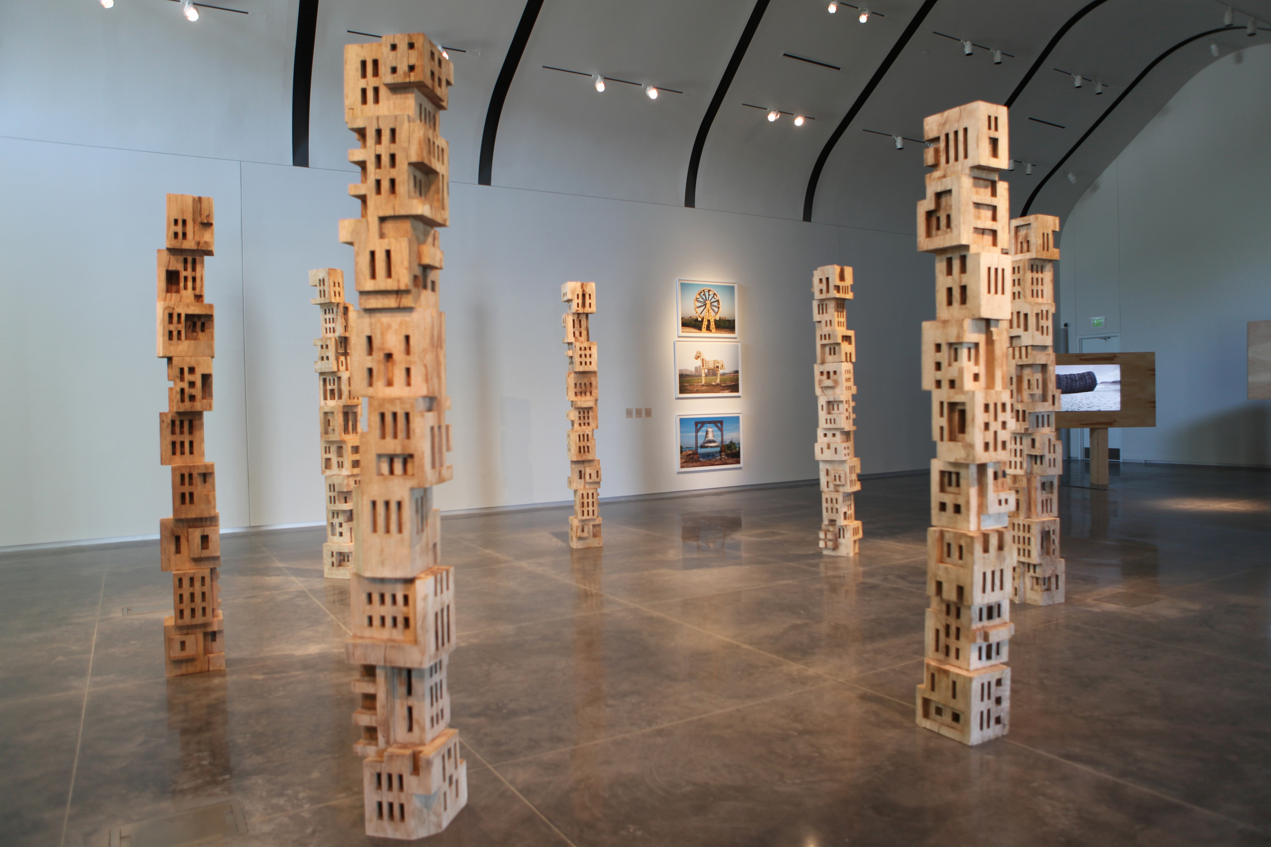
Missouri’s Laumeier Sculpture Park is holding Indian artist Gigi Scaria’s major solo exhibition “Time” until 14 August 2016, exploring the intertwined issues of time and mega-cities formation.
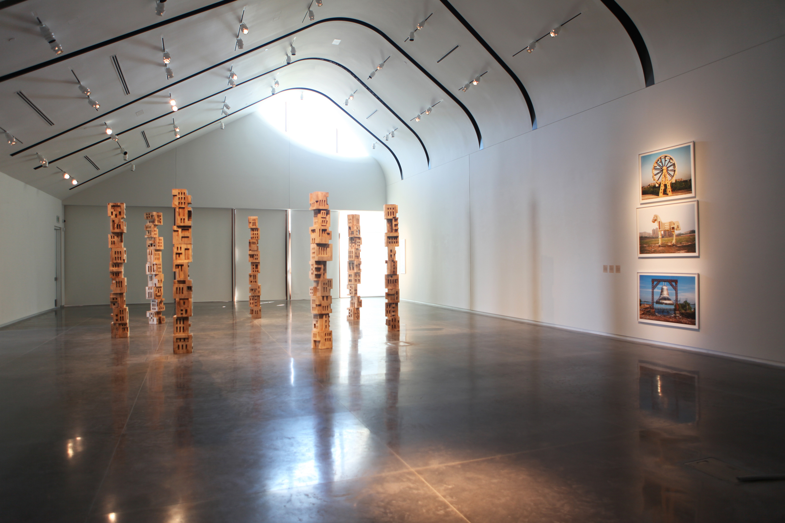
Gigi Scaria, ‘Woodhenge’, 2016, wood, paint, glue, 144 in each (7 poles). Image courtesy the artist.
The exhibition Time suggests that temporalities are different in different parts of the world, and that a finely nuanced calibration of time is an essential requirement for understanding a fractured world. This observation from Chaitanya Sambrani’s catalogue essay quite aptly summarizes Gigi Scaria’s solo exhibition Time on view at the Laumeier Sculpture Park, Missouri from April 16 until August 14, 2015.
Scaria’s exhibition follows that of RAQS Media Collective’s as part of Laumeier’s New Territories: BRICS Curatorial Program, that serves a two-pronged focus: firstly, working with artists from erstwhile developing economies that are now powerful global players and secondly, helping to diversify the Sculpture Park’s collection.
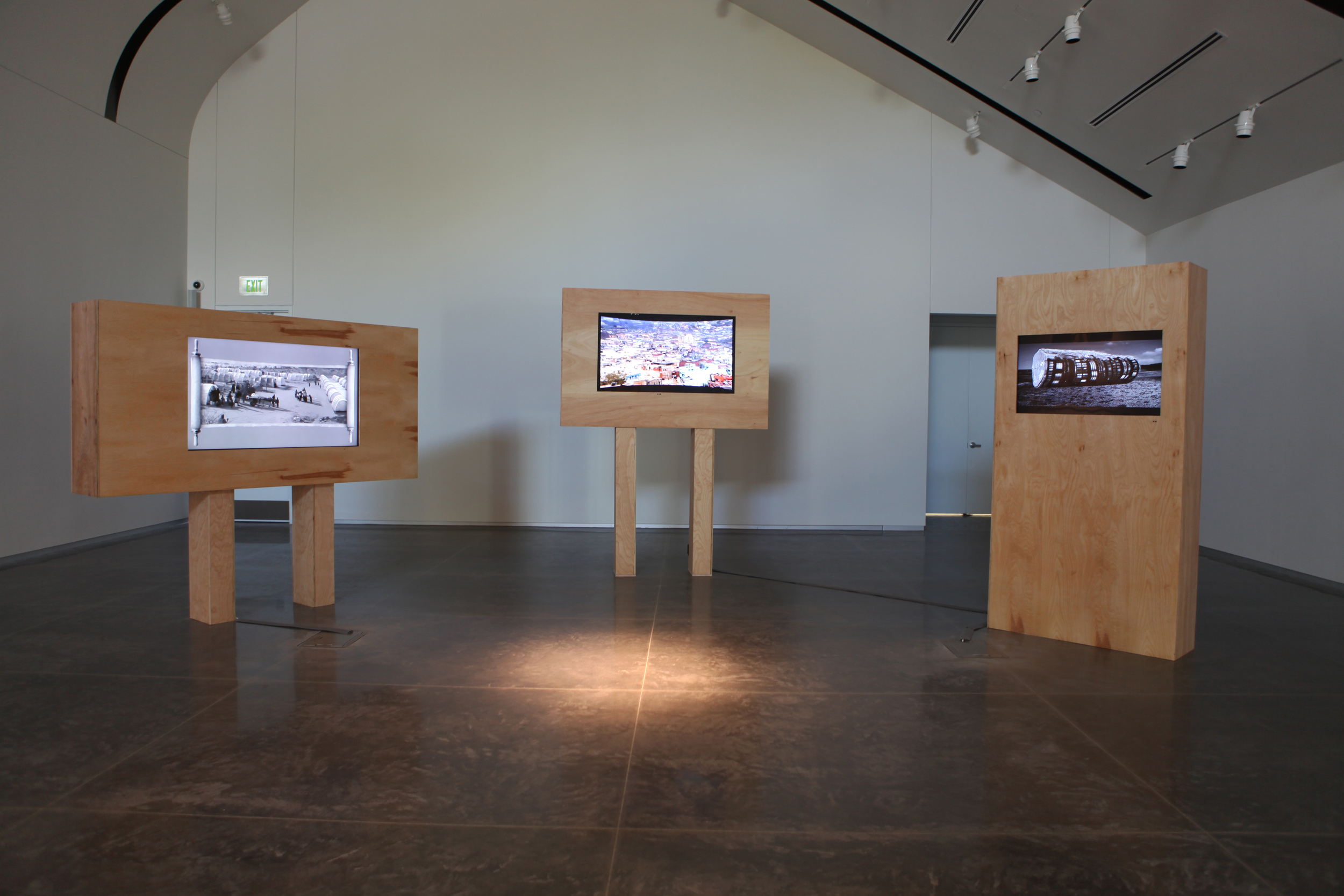
Furthermore, the completion of the Aronson Fine Arts Center in time for Scaria’s show allowed for a cohesive curated exhibit including four photographs, three films, a large indoor sculpture and a new outdoor commission. In doing so, Laumeier has also expanded on its own role as a Sculpture Park and will be looking to play off the inside/outside spatial duality more so in the future.
Gigi Scaria, ‘Shadow of the Ancestors’, 2015, ‘Expanded’, 2015 & ‘Panic City’, 2006. Installation view of “Time”, 2016, Laumeier Sculpture Park. Image courtesy the artist.
Scaria’s exhibition follows that of RAQS Media Collective’s as part of Laumeier’s New Territories: BRICS Curatorial Program, that serves a two-pronged focus: firstly, working with artists from erstwhile developing economies that are now powerful global players and secondly, helping to diversify the Sculpture Park’s collection.
Furthermore, the completion of the Aronson Fine Arts Center in time for Scaria’s show allowed for a cohesive curated exhibit including four photographs, three films, a large indoor sculpture and a new outdoor commission. In doing so, Laumeier has also expanded on its own role as a Sculpture Park and will be looking to play off the inside/outside spatial duality more so in the future.
Responding to the Park’s invitation about two years ago, Scaria scheduled a series of site visits in the region of Cahokia, the largest pre-Columbian settlement north of Mexico. Inspired by the local landscape and the relics of its historical past, Scaria centered the conceptual framework of his show on Cahokia’s mounds and its astronomical observatory known as Woodhenge. The exhibition’s curator Dana Turkovic elaborates on the exhibition’s pieces. According to her, each work draws on totemic themes, continuing Scaria’s inquiry regarding “time” and community collapse by cross-pollinating the disappearing architecture and symbols from New Delhi with Missouri’s regional history, using the formal organization of the historical Woodhenge.
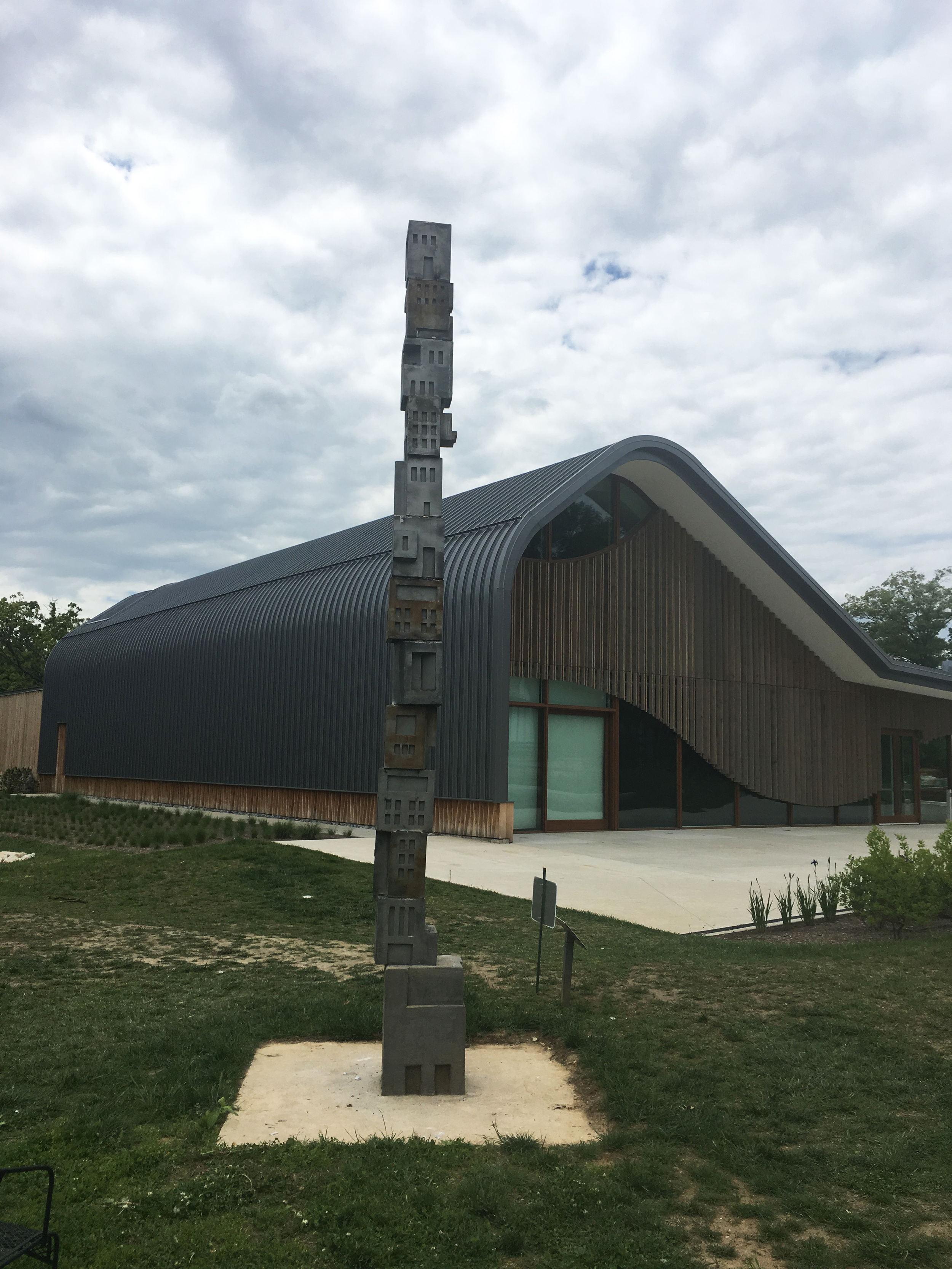
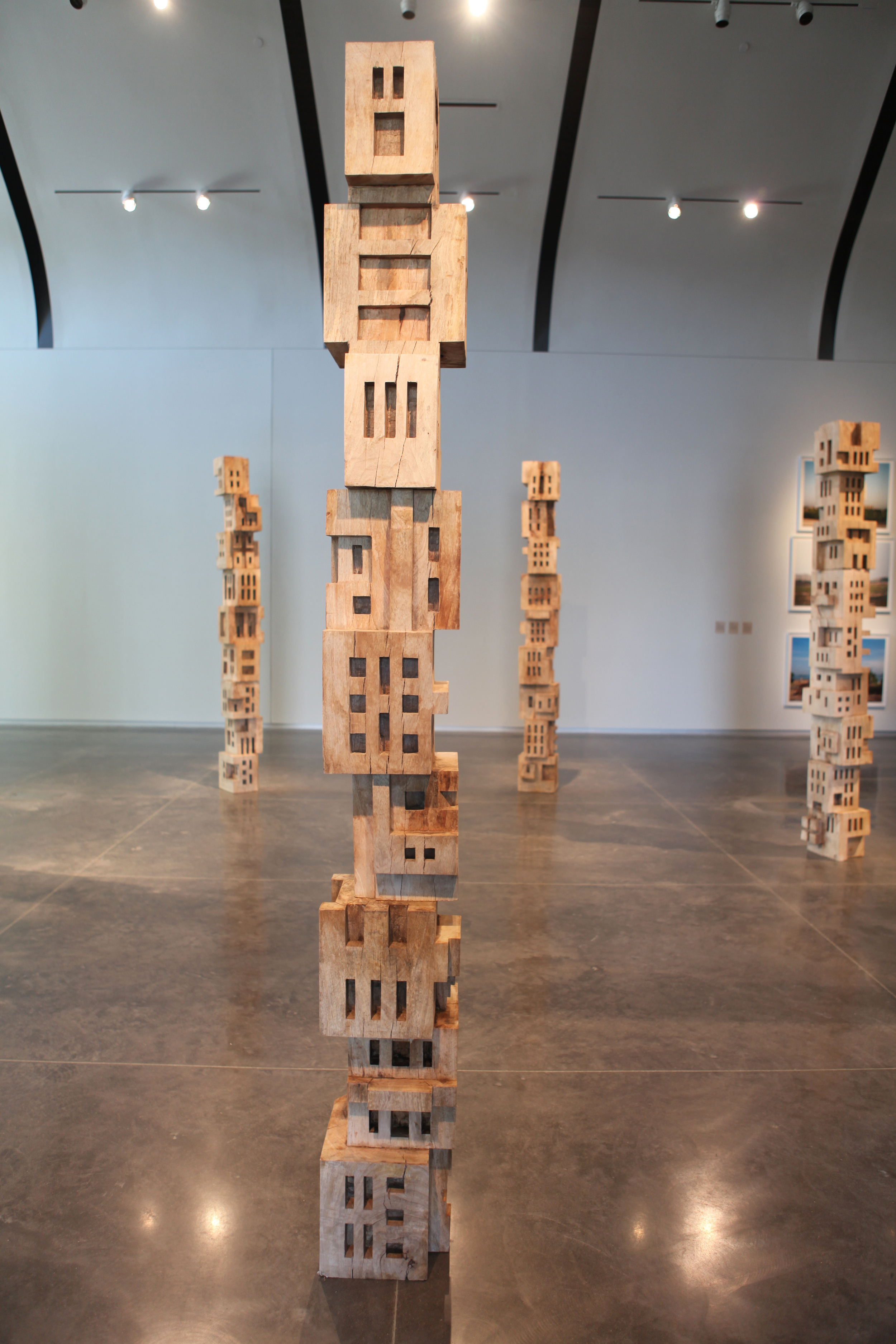
Scaria’s indoor sculpture Woodhenge, 2016 is comprised of seven ten-foot poles in a circular arrangement, mimicking the formal shape of the circle of 44 tall wooden posts of Cahokia’s Woodhenge. The poles are made up of maquettes of disappearing Delhi domestic spaces, meticulously carved in wood and stacked on top of each other. The same is true for the monumental 16 feet high stainless steel outdoor sculpture by the same name.
Scaria further expands on the stacking of apartments as a way of imagining the expansion of a modern city. A simple material necessity meant that three pillared sections, each measuring one foot square, had to be placed on top of each other in order to attain the desired height for the sculpture. But ironically, this process also cemented Scaria’s anxiety of an overburdened city. He explains to Art Radar that he specifically recreates architectures that are devoid of humans as a way to inform our understanding of the rampant drive to build more inhabitable dwelling spaces.
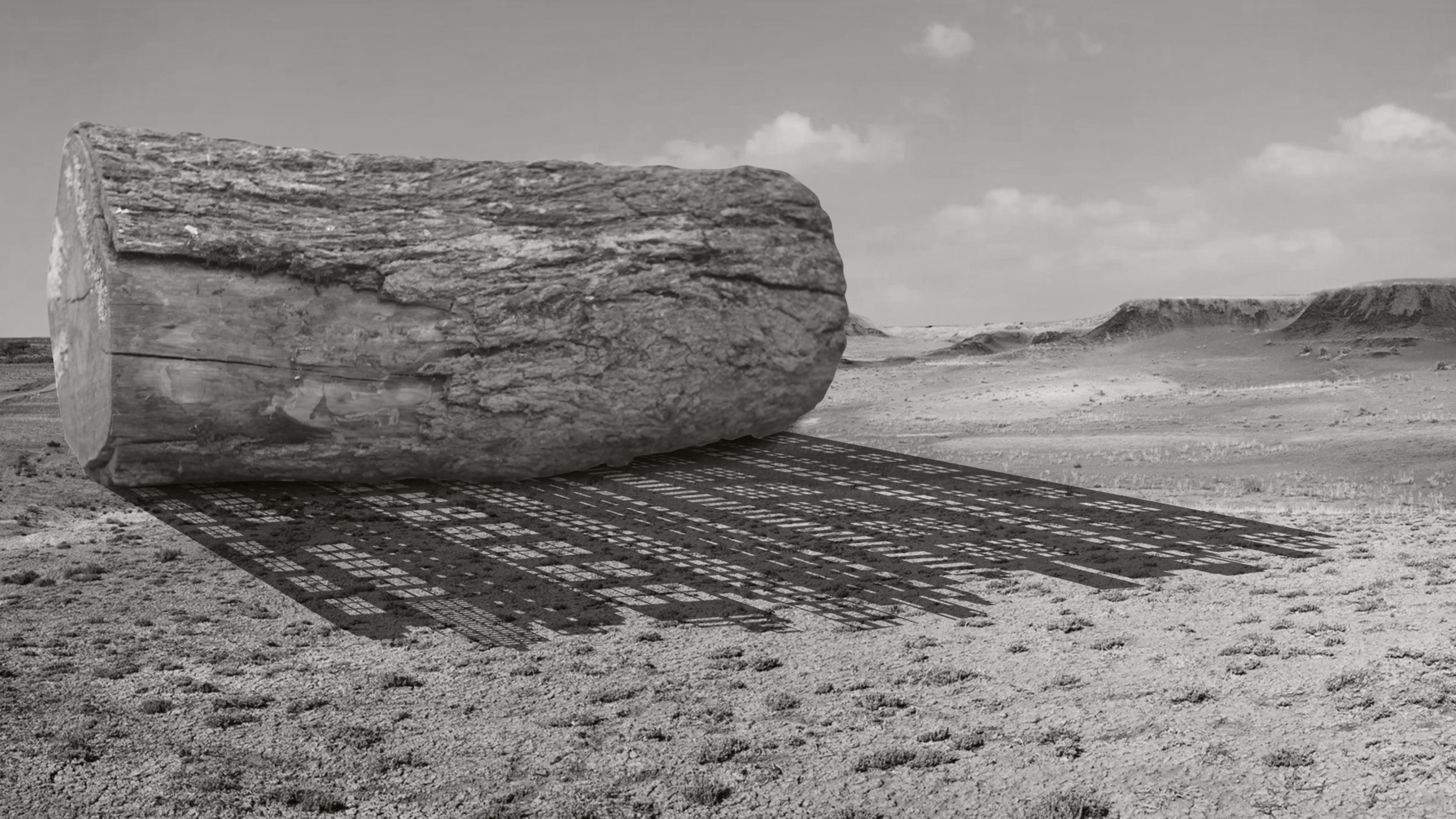
Shadow of the Ancestors and Expanded (both 2015) are animation videos produced for a body of work inspired by the tale of Noah’s Ark. Nestled between apocalyptic doom and the fight for salvation, the videos continue Scaria’s dialogue on habitation. In the former, a decaying log in a grainy deserted landscape is consumed by its shadowy cityscape, while the latter is a visual time-line of archetypal housing announced on a moving scroll. The linear motion in the videos seals their fate in urban desolation.
The third video Panic City (2006) observes the rhythmic rise and fall of a city, played to a classical symphony that ridicules the pulse of alleged urban progress.
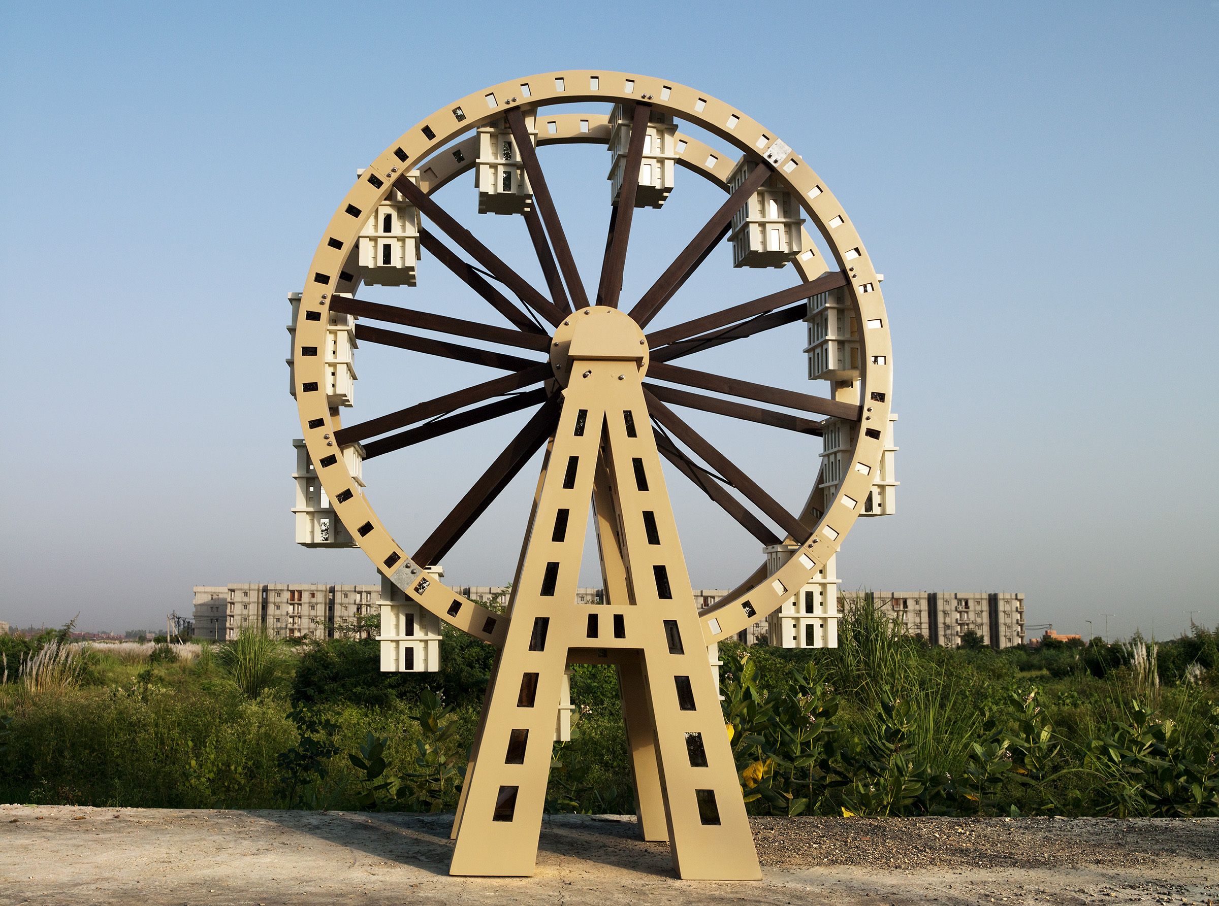
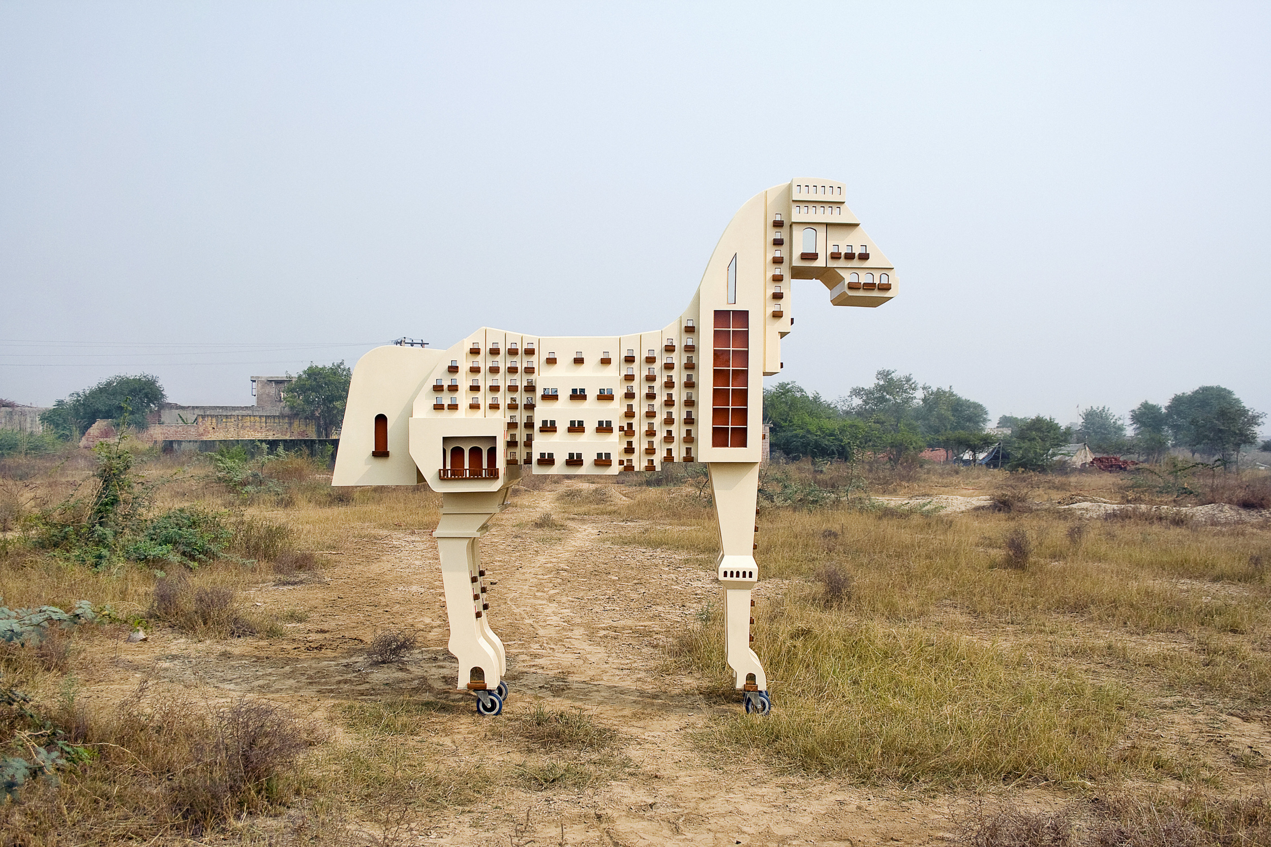
The exhibition concludes with four photographs – stills from sculptural performances that document prior monumental work. Wheel (2009) takes the form of a giant ferrous wheel mocking the urban middle class, desirous of modern living, but contained in small matchbox sized apartments. In the same strain of thought is Someone Left a Horse on the Shore(2009). This work depicts a (Trojan) horse, one that is made of city structures, yet symbolises deceit.
Chronicles of the Shores Foretold (2014) is part of a photo series documenting the performance that is the fabrication and installation of a large-scale public work made for the Kochi Biennale in 2014 signifying the passage of time and experience of religion in the coastal region. Puzzled yet Undaunted (2010) depicts the apartment structures on top of a canon’s barrel, rendering the ammunition useless. All three mobile sculptures tell of displaced desires and peoples, of migration and homelessness and of our restless times.
In terms of the layout of the exhibition, Turkovic reveals to Art Radar,
“We wanted to create an experience that was still sculptural and played on the motifs in Scaria’s work so, we built support structures that housed the TV monitors for Scaria’s films. We (at Laumeier) imagined the exhibition as a reflection of his interest in architecture. The four photographs and the three films are not only important conceptual elements, but they also demonstrate Scaria’s way of working in the public realm. The catalog design was special too. We worked with a local design firm called Paradowski Creative. The designer really captured Scaria’s ideas by creating something that physically demonstrated a built environment or architecture.”
On reception of the exhibition and its content:
“the audience seems pleased to see the Woodhenge work since St. Louisans like to see the history of their landscape reflected in the art at Laumeier. Especially, through the eyes of someone who isn’t from here. I think people also appreciate the process of the artist coming to St. Louis and visiting the historical sites, and ultimately seeing and how Scaria related his view and experience here to what he sees on a daily basis in India.”
The India Art Fair 2016 scorecard: spotlighting India’s great artists
Art Radar explores who faired well and what’s to learn at India Art Fair 2016.
The India Art Fair closed its doors on 31 January 2016. Art Radar rounds up the most memorable moments and artists seen during the four-day event.
Rina Banerjee at Hosfelt Gallery, California. Image courtesy Hosfelt Gallery.
he eighth edition of the India Art Fair opened on 28 January 2016 with news of a three-year partnership with BMW, the launch of a series of art awards by the India Today Group and a committed focus on art from the Asian subcontinent. This year did also see increased international participation, a better design that enabled easy navigation through the fair and an extended programme of talks and project presentations.
India’s great artists
With most galleries opting to display a rather safe selection of artwork of ‘saleable artists’, the fair lacked an element of freshness and missed those few moments of surprise. Nevertheless, the selection of art on show provided a level of comfort for both the uninitiated collector and for the existing contemporary art collector.
Delhi-based galleries (who were the majority) like Nature Morte showed their ace artists Subodh Gupta and Faig Ahmed, Gallery Espace presented the likes of Zarina and Manjunath Kamath, while Vadehra Art Gallery’s booth hosted works by Atul Dodiya and Shilpa Gupta. The overall quality of work presented seemed to be better than that of the last edition and a very welcome change. Feedback from galleries on organisation revealed far fewer creases to iron out with many claiming it to be in the league of Frieze and Art Basel.
Collector Radhika Chopra commented to Flint PR:

Faig Ahmed, ‘Step by Step’, at Gallery Nature Morte. Image courtesy Nature Morte.
“As a collector I would say the fair is tighter and more thoughtfully edited, particularly with regard to the galleries. It is an all round better experience, with considerable thought given to visitors in terms of the layout and overall experience as well as the fun side of fair.”
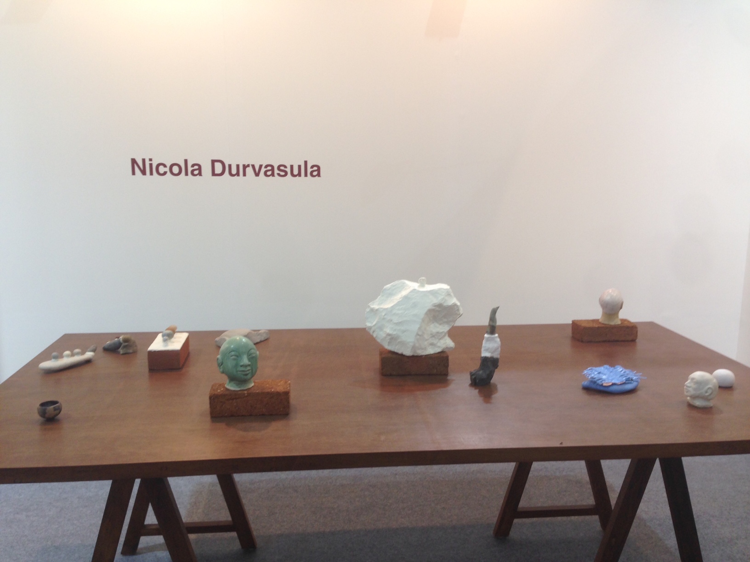
Nicola Durvasula’s solo presentation at Galerie Mirchandani + Steinruecke. Image courtesy Galerie Mirchandani + Steinruecke.
A fresh curatorial approach
This year also saw more crisply curated gallery booths, such as Mumbai’s Galerie Mirchandani + Steinruecke with their solo presentation of terracotta sculptures and watercolours by Nicola Durvasula, and Sabrina Amrani from Madrid showing four artists including Pakistani Waqas Khan’s quiet, reflective drawings.
Solo artist representations seemed a popular choice with international galleries who saw wisdom in highlighting the range and evolution of a single artist’s practice. Gallery Hosfelt from California showed a depth of Rina Banerjee’s work. Thomas Erben Gallery from New York showed photographs by Yamini Nayar dating from 2005, while Dubai-based Grey Noise presented the geometric compositions of Fahd Burki.
Sabrina Amrani, Madrid, gallery booth presenting works by Joël Andrianomearisoa, Ayesha Jatoi, Waqas Khan, Timothy Hyunsoo Lee and UBIK. Image courtesy Sabrina Amrani.
Successful sales
Day one witnessed an excitement amongst exhibitors, with some like Mumbai’s Gallery Isa, who sold four pieces by European contemporary artists including Achraf Touloub and Matthias Bitzer to Indian collectors within the first few hours. Sales for most galleries remained those made on the first day alone, except for Experimenter (Kolkata) and GALLERYSKE (Bangalore/ Delhi) and Lakeeren who reported excellent sales.
Dr Arshiya Lokhandwala of Lakeeren Gallery, as quoted by the fair organisers, observed:
“There is noticeably more energy than last year, with many new collectors visible. We’re very optimistic and it feels good to be back here. We’ve sold a number of works across a range of prices (from 1-20 Lakh Rupees). People are responding really well to the booth and we have the pick of collectors who are interested.”

Prateek Raja, Director of Experimenter Gallery, in conversation with visitors at the fair. Image courtesy Experimenter Gallery.
Attendance, this year was limited to the art ‘insiders’ – a sophisticated audience whose interest in art is either limited to the Moderns or blue-chip contemporary artists, with only a few committing to a purchase by closing day.

Mohsin Shafi , ‘Confessions of a Centrefold’, at the Taseer Art Gallery booth. Image courtesy Taseer Art Gallery.
Baudoin Lebon from Paris told Art Radar:
“We are engaging younger new collectors across new markets. People are buying and asking and engaging, from the top end of the collectors but also especially from this huge emerging middle market. This year the fair has really improved a lot. It has evolved, and matured, and as a gallery we are really happy.”
DAG Modern (Delhi Art Gallery) brought in the bigwigs of the Indian art world: a stunning Amrita Shergil canvas, an untitled bronze sculpture by Ramkinkar Baij, a Mother and Child portrait by Jamini Roy amidst a host of masterpieces by M.F. Husain, F.N. Souza, S.H. Raza, Avinash Chandra and Shanti Dave. With another pavilion across the two main halls of the fair, designed as a mini-museum with its own programme of screening, talks and curator-led walks, DAG Modern putting their best foot forward, even published their own newsletter – Art @ the Fair.
There were also some interesting new projects, such as an exquisite collection of “Company Paintings” presented by Noida’s Swaraj Art Archive, the works of Farida Batool and Mohsin Shafi at Taseer Art Gallery’s space from Lahore and art by Pala Pothupitiya and Jagath Weerasinghe from Theertha International Artists Collective, Colombo representing their own work.
A new curatorial direction
Overall, Zain Masud’s coming on board as International Director did work its charm, with many claiming a heightened level of professionalism and ‘seriousness’ to the fair. For galleries showing for the first time, Masud’s presence and the direction of programming towards a South Asia focus was a step in the right direction. However, with the collector pool not having expanded, galleries had little incentive to show new artists. The pace was slower, new collectors were few and far between.
With the neighbouring brand of the successful Dhaka Art Summit and a saturated market in need of new invigorating models of engagement, the India Art Fair seemed to be missing the manic activity of a busy art fair, perhaps even due to ‘fair fatigue’. However, the India Art Fair still provided a pleasant experience, well designed to allow both the viewer and buyer to absorb the art presented and to get acquainted with some of the most influential and recognised artists on the Indian scene today.